Retail & Brand / GUIDE 08
Interior Design Shanghai: Retail Display Hierarchy
Create a clear product display hierarchy for a Shanghai shop using focal points, supporting ranges and a consistent approach to product information.
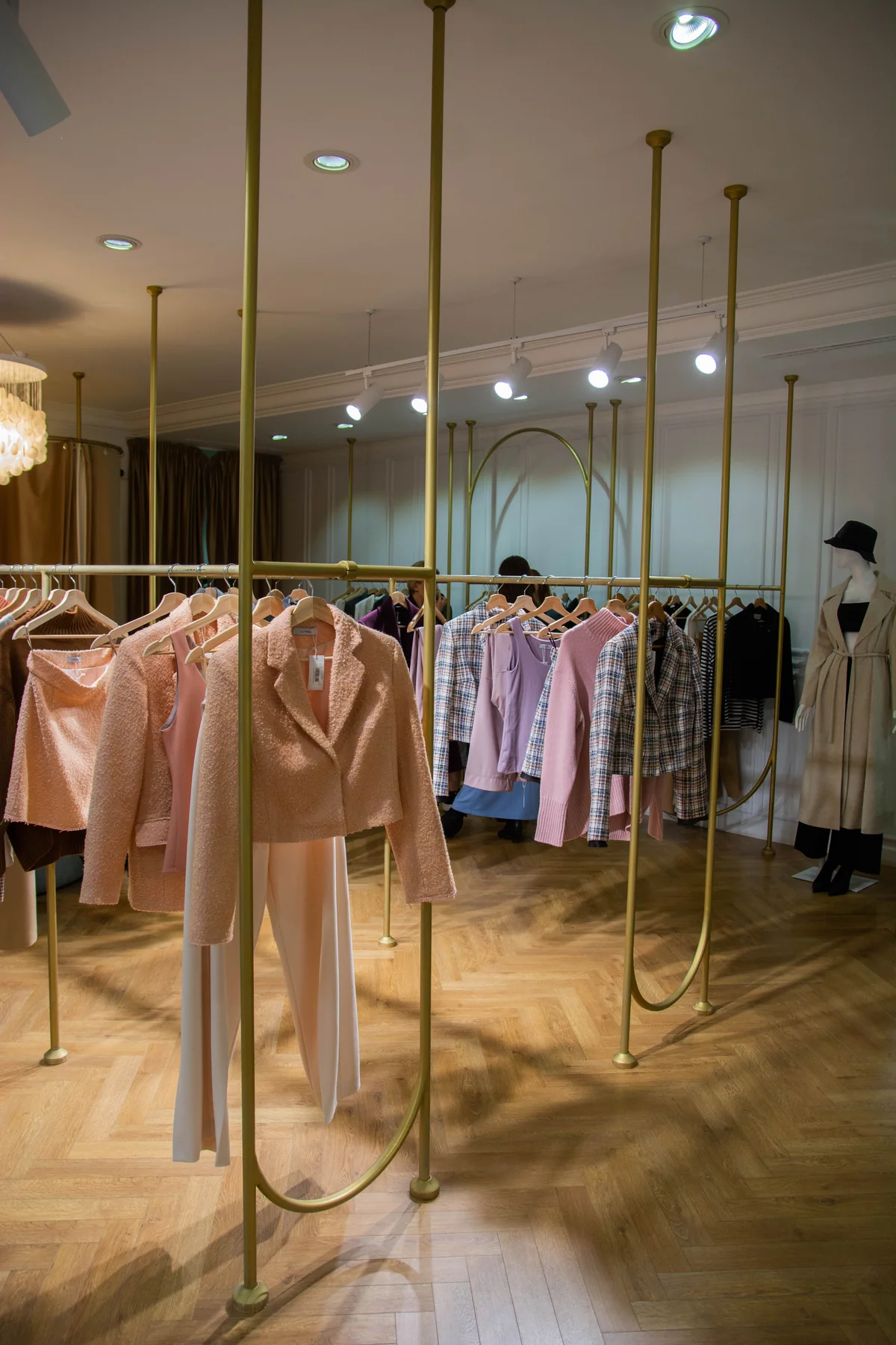
The essential idea
Retail display hierarchy helps customers distinguish the main offer from supporting products and detailed information. Choose a few focal points, organise the rest by a clear logic and keep circulation readable. Review the display with real stock so scale, quantity and replenishment are considered together.
When every retail display asks for equal attention, a shop can become harder to understand. Customers may see many products without recognising where to begin or how the ranges relate. For a Shanghai retail interior, hierarchy provides a practical editing method. It assigns different jobs to feature displays, everyday merchandise and supporting information, helping the store communicate clearly without stripping away its character.
Decide what deserves first attention
Choose the product, collection or message that should lead in each important view. Consider the entrance, the approach to a major display and the view from a consultation area. One focal point does not need to dominate every part of the shop.
Make the decision with the merchandise and brand teams. A visually striking object may be useful, but it should relate to what the store wants customers to understand. Record the reason for each feature display so future resets can preserve its purpose.
Give supporting products a clear order
Organise the remaining products through a consistent relationship, such as use, size, collection or material. The best grouping depends on how customers compare the offer. Avoid changing the organising principle repeatedly without making the change understandable.
Use actual stock to test density. A shelf that looks elegant with one sample may behave differently when it holds the intended range. Review how items are removed and replaced, and whether the arrangement remains legible after several customers have handled it.
Control the visual weight of fixtures
Fixture height, finish and spacing influence how strongly a display reads. A dark, solid unit may attract attention even when the merchandise on it is not intended to lead. Compare fixtures and products together rather than approving the architecture separately.
Leave enough visual breathing room around the most important display. This does not mean making the whole store sparse. It means varying density deliberately so the eye can recognise a difference between a focal presentation and a supporting range.
Coordinate lighting with the hierarchy
Discuss which products need emphasis and which areas need more even illumination. Review reflections, shadows and the visibility of labels with the lighting team. The lighting arrangement should remain useful within the planned range of display changes.
Do not assume that making one area brighter automatically improves the whole composition. The relationship between adjacent displays and the customer's viewpoint matters. Test representative products, including their colours and surfaces, under the proposed light.
Keep information easy to scan
Product names, prices, sizes and supporting explanations have different levels of importance. Establish a consistent information system and place it where customers need it. Avoid asking a visitor to search several unrelated signs to understand one display.
Coordinate typography and graphic placement with the brand identity. The information should remain readable in the actual store conditions and from the intended viewing position. Where content changes regularly, choose a replacement method that staff can use without damaging fixtures or finishes.
Review the display after a normal trading cycle
Ask the store team what becomes untidy, difficult to replenish or confusing to explain. These observations can reveal whether the hierarchy is too dependent on an untouched arrangement. Adjust the system so it can retain clarity during ordinary use.
- Identify the primary message in each key view.
- Test supporting ranges at realistic stock levels.
- Check fixture weight and product visibility together.
- Coordinate lighting and information with the display roles.
- Document reset examples that staff can follow.
A clear hierarchy gives a Shanghai shop a repeatable way to present changing merchandise. The result is a room that helps customers compare and explore while giving the retail team a practical framework for maintaining its appearance.
Common questions
Should the entrance show the widest possible product range?
Not necessarily. A focused introduction may be easier to understand, with the broader range revealed further inside. Decide according to the store's offer, customer needs and the way products are compared.
How many focal displays should a shop have?
There is no fixed number. Assess the size, sightlines and merchandise strategy, then ensure each key view has a clear order. Too many competing focal points can make the overall display less understandable.